

Building Your First Web Page
Choosing the Right Tools
To kick things off, we need to pick the right tools for our web adventure! Here’s what we recommend:
- Text Editor: Something like Visual Studio Code or Notepad++ will do the trick.
- Web Browser: Chrome, Firefox, or Safari—pick your favorite!
- Version Control: Git is a lifesaver for keeping track of changes.
Setting Up Your Project
Now that we have our tools, let’s set up our project. Here’s a simple checklist:
- Create a new folder for your project.
- Inside that folder, create an
index.htmlfile. This will be our main page. - Optionally, create a
styles.cssfile for our styles.
Writing Basic HTML
Let’s dive into writing some HTML! Here’s a super simple structure to get us started:
<!DOCTYPE html>
<html>
<head>
    <title>My First Web Page</title>
</head>
<body>
    <h1>Welcome to My Web Page!</h1>
    <p>This is my first attempt at creating a web page.</p>
</body>
</html>
Remember, every great web page starts with a simple structure!
Building a web page is like making a sandwich: you need the right ingredients and a good recipe to make it tasty!
Getting to Know HTML

Understanding HTML Elements
HTML, or HyperText Markup Language, is the backbone of every web page. It’s like the skeleton that holds everything together. Without HTML, we’d just have a blank screen! Here are some key elements you’ll encounter:
- Tags: These are the building blocks of HTML. They tell the browser how to display content.
- Elements: A tag and its content make up an element. For example,
<p>This is a paragraph.</p>is a paragraph element. - Nesting: You can put elements inside other elements. Just like stacking boxes!
Using Attributes Effectively
Attributes provide additional information about elements. Think of them as little notes attached to your tags. Here’s how to use them:
- Syntax: Attributes go inside the opening tag. For example,
<a href="https://example.com">Click here</a>. - Common Attributes: Some popular ones include
href,src, andalt. - Best Practices: Always use meaningful names for your attributes to keep your code clear.
Creating Links and Images
Links and images are essential for making your web pages interactive and visually appealing. Here’s how to do it:
- Links: Use the
<a>tag to create hyperlinks. Example:<a href="https://example.com">Visit Example</a>. - Images: Use the
<img>tag to add pictures. Example:<img src="image.jpg" alt="A description of the image">. - Testing: Always check your links and images to ensure they work properly!
Remember, learning HTML is like learning a new language. The more you practice, the better you’ll get!
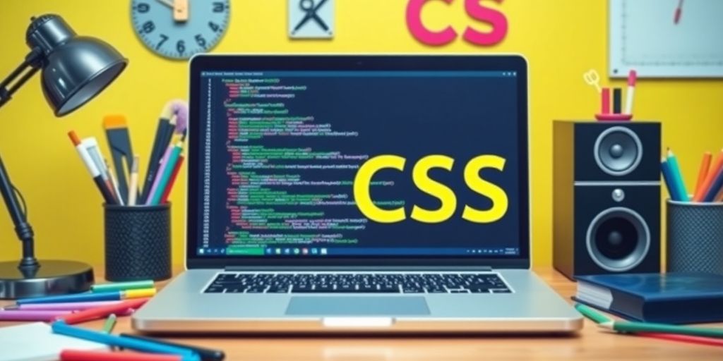
Diving into CSS
Styling Text and Fonts
When we dive into CSS, the first thing we want to do is make our text look good. CSS lets us change fonts, sizes, and colors easily! Here are some things we can do:
- Change the font family (like Arial, Times New Roman, etc.)
- Adjust the font size (small, medium, large)
- Set the font color (red, blue, or even hex codes)
Working with Colors and Backgrounds
Next up, let’s splash some color on our web pages! CSS allows us to:
- Change the text color using the
colorproperty. - Set background colors with the
background-colorproperty. - Use images as backgrounds with the
background-imageproperty.
Here’s a quick table to help us remember some color codes:
| Color Name | Hex Code |
|---|---|
| Red | #FF0000 |
| Green | #00FF00 |
| Blue | #0000FF |
Using CSS Selectors
Selectors are like magic wands that let us choose which elements to style. Here are some common selectors:
- Element Selector: Targets all elements of a specific type (e.g.,
pfor paragraphs). - Class Selector: Targets elements with a specific class (e.g.,
.myClass). - ID Selector: Targets a unique element with a specific ID (e.g.,
#myId).
Remember, using the right selector can make your life a lot easier when styling your web pages!
Mastering Layout with CSS
When it comes to web design, mastering layout is like learning to ride a bike—once you get it, you’ll never forget! Let’s dive into some key concepts that will help us create stunning layouts with CSS.
Understanding the Box Model
The box model is the foundation of CSS layout. Every element on a web page is a box, and understanding how these boxes interact is crucial. Here’s a quick breakdown:
- Content: The actual content of the box, like text or images.
- Padding: The space between the content and the border.
- Border: The line that surrounds the padding (if any).
- Margin: The space outside the border, separating the box from other elements.
| Box Model Component | Description |
|---|---|
| Content | The inner part where text/images go. |
| Padding | Space around the content. |
| Border | The outline of the box. |
| Margin | Space outside the border. |
Using Flexbox for Layouts
Flexbox is a powerful tool for creating responsive layouts. It allows us to align items easily and distribute space within a container. Here are some tips:
- Set the display property to flex on the container.
- Use justify-content to align items horizontally.
- Use align-items to align items vertically.
Creating Grid Layouts
CSS Grid is another fantastic way to create complex layouts. It’s like having a grid of boxes to play with! Here’s how to get started:
- Define a grid with
display: grid;. - Use
grid-template-columnsandgrid-template-rowsto set up your layout. - Place items in the grid using
grid-columnandgrid-rowproperties.
Remember: Practice makes perfect! The more we play around with these layouts, the better we’ll get at it. Don’t be afraid to experiment and have fun with CSS!
Advanced HTML and CSS Techniques
Adding Forms and Inputs
Forms are like the magic portals of the web! They let users send information to us. Here’s how we can make them:
- Use the
<form>tag to create a form. - Add input fields with
<input>tags for text, email, and more. - Include buttons to submit the form using
<button>or<input type="submit">.
Embedding Media
Want to make our web pages pop? Let’s add some media!
- Images: Use the
<img>tag to add pictures. Don’t forget thealtattribute for descriptions! - Videos: Use the
<video>tag to embed videos. You can even set it to autoplay (but let’s not annoy our visitors!). - Audio: Use the
<audio>tag to add sound clips. Perfect for background music or podcasts!
Implementing Responsive Design
Responsive design is like magic for making our websites look good on any device. Here’s how:
- Use CSS media queries to change styles based on screen size.
- Flexible layouts: Use percentages instead of fixed sizes for widths.
- Responsive images: Use the
max-width: 100%;style to make images scale down.
Remember: A responsive design ensures that our website is user-friendly on all devices, from phones to desktops!
By mastering these advanced techniques, we can create websites that are not only functional but also fun and engaging!
Best Practices for Writing HTML and CSS

When it comes to writing HTML and CSS, we want to make sure our code is not just functional but also clean and easy to read. Here are some best practices we should keep in mind:
Keeping Your Code Clean
- Use meaningful names for classes and IDs. This helps us and others understand what each part of our code does.
- Indent properly. This makes our code look neat and helps us see the structure at a glance.
- Comment our code. A few notes can go a long way in explaining why we did something a certain way.
Optimizing for Performance
- Minimize HTTP requests by combining files when possible. Fewer requests mean faster loading times!
- Use CSS sprites for images. This reduces the number of image files we need to load.
- Compress our files. Smaller files load faster, so let’s use tools to minify our CSS and HTML.
Ensuring Accessibility
- Use semantic HTML. This helps screen readers understand our content better.
- Provide alt text for images. This is crucial for users who can’t see the images.
- Make sure our site is navigable using just a keyboard. This is important for users with disabilities.
Remember, writing clean and efficient code not only helps us but also makes the web a better place for everyone!
Wrapping It Up: Your HTML and CSS Adventure Awaits!
So there you have it! Learning HTML and CSS is like building a cool LEGO set—each piece fits together to create something awesome. Remember, every expert was once a beginner, so don’t sweat it if things feel tricky at first. Just keep practicing, and soon you’ll be styling websites like a pro! Whether you want to make a personal blog or a fancy portfolio, the skills you pick up will open doors to endless possibilities. So grab your virtual toolbox, dive in, and let your creativity shine! Happy coding!